Arithmetic
Additive Identity
Arithmetic Progression
Associative Property
Averages
Brackets
Closure Property
Commutative Property
Conversion of Measurement Units
Cube Root
Decimal
Distributivity of Multiplication over Addition
Divisibility Principles
Equality
Exponents
Factors
Fractions
Fundamental Operations
H.C.F / G.C.D
Integers
L.C.M
Multiples
Multiplicative Identity
Multiplicative Inverse
Numbers
Percentages
Profit and Loss
Ratio and Proportion
Simple Interest
Square Root
Unitary Method
Algebra
Cartesian System
Order Relation
Polynomials
Probability
Standard Identities & their applications
Transpose
Geometry
Basic Geometrical Terms
Circle
Curves
Angles
Define Line, Line Segment and Rays
Non-Collinear Points
Parallelogram
Rectangle
Rhombus
Square
Three dimensional object
Trapezium
Triangle
Quadrilateral
Trigonometry
Trigonometry Ratios
Data-Handling
Arithmetic Mean
Frequency Distribution Table
Graphs
Median
Mode
Range

Videos
Solved Problems
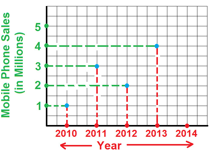
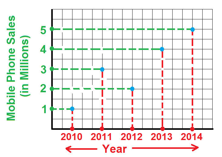
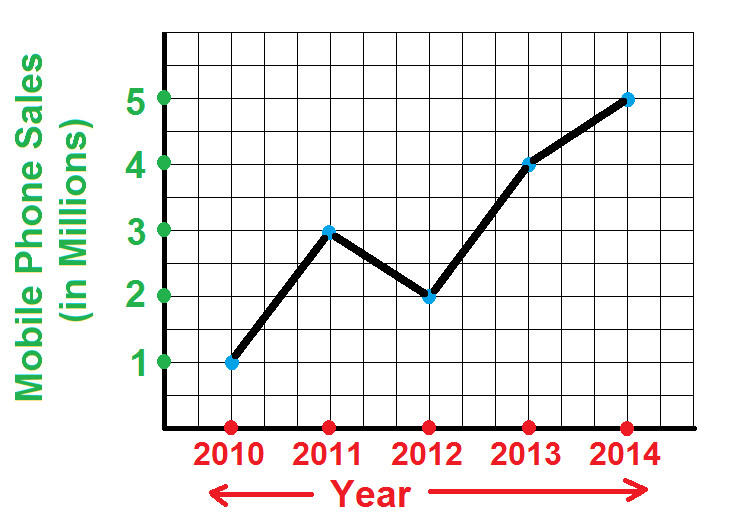
Home >> Graphs >> Line Graph >>

Line Graph

Pictograph Bar Graph Double Bar Graph Histogram Pie Graph
Line Graph Difference between Bar Graph and Histogram

A Line Graph shows the variation in data that occurs over periods of time
Or we can say that:
A Line Graph displays data that changes continuously over periods of time.

The horizontal lines are known as x-axis and verticals lines are known as y-axis.

Example 1: The following table illustrates the sales of Mobile phones from 2010 to 2015. Draw a line graph from the below table

Year 2010 2011 2012 2013 2014
Mobile Phone Sales (in millions) 1 3 2 4 5


Solution: As per given question:
Year will be on x-axis and Mobile Phone Sales will be on y-axis (as shown below)


Steps for construction of line graph:

Step 1: During year 2010, mobile phone sale was 1 million. So draw two lines from both and highlight the point where both these lines intersect (as show below):


Step 2: During year 2011, mobile phone sale was 3 million. So draw two lines from both and highlight the point where both these lines intersect (as show below):


Step 3: During year 2012, mobile phone sale was 2 million. So draw two lines from both and highlight the point where both these lines intersect (as show below):


Step 4: During year 2013, mobile phone sale was 4 million. So draw two lines from both and highlight the point where both these lines intersect (as show below):


Step 5: During year 2014, mobile phone sale was 5 million. So draw two lines from both and highlight the point where both these lines intersect (as show below):


Step 6: Join all the blue highlighted point and we get the required line graph (as shown below):


Copyright@2022 Algebraden.com (Math, Algebra & Geometry tutorials for school and home education)